After todays lecture we were set the task of creating our own form of post production. We were given a range of different pieces of paper with images text and collages printed onto them, we then had to create them into something else and create a short clip to show them. We used coloured pens and collage techniques to create these. I thoroughly enjoyed this seminar as it gave me the chance to just work randomly with my peers to create something which i think is incredibly visually interesting.
video-1489418485 from Jessica Mountford on Vimeo.
Showing posts with label Theory as Practice. Show all posts
Showing posts with label Theory as Practice. Show all posts
Monday, 13 March 2017
Post Production
During todays lecture we learnt a number of different things about post production, a process which happens after production and often means to develop something that has been produced to create something new.
Postproduction can be defined as…
The stage in the production of a media output, typically involving editing and the addition of other elements
The set of processes applied to recorded material, e.g. montage, the inclusion of other visual or audio sources, subtitling, voice overs and special effects.
Taking data that has been captured and cutting it up, moving it around, filtering and shaping it into a finished work.
Postproduction can be defined as…
The stage in the production of a media output, typically involving editing and the addition of other elements
The set of processes applied to recorded material, e.g. montage, the inclusion of other visual or audio sources, subtitling, voice overs and special effects.
Taking data that has been captured and cutting it up, moving it around, filtering and shaping it into a finished work.
What is digital media
Nicholas Bourriaud, Postproduction 2002
The artistic question is no longer ‘what can we make that is new’ but ‘ how can we make do what we have’ artists today program forms more than they compose them.
Nicholas Bourriaud, Postproduction 2002
The artistic question is no longer ‘what can we make that is new’ but ‘ how can we make do what we have’ artists today program forms more than they compose them.
Use parts of other things to create our own things.
How are cultural practitioners using ‘postproduction’, according to Bourriaud
By creating hybridised art forms emerging out of interdisciplinary media arts practices.
Using new media technologies to both compose their art work as well as display it and or stream it through the networked space
Repurposing
By creating hybridised art forms emerging out of interdisciplinary media arts practices.
Using new media technologies to both compose their art work as well as display it and or stream it through the networked space
Repurposing
Marcel Duchamp - the Readymade as postproduction. Fountain 1917
To create is to insert an object into a new context or scenario; to consider it an element of a bigger narrative. In a sense, the works journey becomes part of dialogic process - each artistic curatorial or interpretive decision made on its behalf might be compared to conversational turn taking.
Marshall Macluhan, The Medium is the Massage. - different way of presenting the same information - postproduction of the original text.
Postproduction as dialogue: in Tacit Dean, Trying to Find the Spiral Jetty (1997)
Bricolage:
To create is to insert an object into a new context or scenario; to consider it an element of a bigger narrative. In a sense, the works journey becomes part of dialogic process - each artistic curatorial or interpretive decision made on its behalf might be compared to conversational turn taking.
Marshall Macluhan, The Medium is the Massage. - different way of presenting the same information - postproduction of the original text.
Postproduction as dialogue: in Tacit Dean, Trying to Find the Spiral Jetty (1997)
Bricolage:
In art or literature - construction or creation from a diverse range of available things.
Bricolage does not necessarily need to have a clear end in sight
Bricolage means to engage in a dialogue with a heterogeneous collection of materials and tools in which items are repurposed and rearranged to solve a problem (Sharpes et al 2014)
Bricolage is a french word that means the process of improvisation in a human endeavour. the word is derived from the French verb bricoler (to tinker), with the english term DIY being the closest equivalent of the contemporary french usage.
Lucy Kimble Post-producing postproduction, 2004.
Mark Amerika, Remix the book 2011
DIY trends in contemporary practice challenge 20th century notions of what an artist is.
Bricolage does not necessarily need to have a clear end in sight
Bricolage means to engage in a dialogue with a heterogeneous collection of materials and tools in which items are repurposed and rearranged to solve a problem (Sharpes et al 2014)
Bricolage is a french word that means the process of improvisation in a human endeavour. the word is derived from the French verb bricoler (to tinker), with the english term DIY being the closest equivalent of the contemporary french usage.
Lucy Kimble Post-producing postproduction, 2004.
Mark Amerika, Remix the book 2011
DIY trends in contemporary practice challenge 20th century notions of what an artist is.
William Boroughs developed literary cut ups, in which he created new art forms from previously made ones by blending images together in what we would call a collage.
I found this lecture very interesting and the facts that we learnt demonstrates how design is forever evolving and developing in ways which we don't always see with the naked eye, until we are shown by someone else. I will research further into post production and find works which I find interesting and visually pleasing.
Carioca Studio rep. by JSR, 2014

I have also found a number of images which have been taken from Sovereign Studio, these images all demonstrate post production but in a way that is completely visual to anyone who sees them. I think that all of these images have been well produced, and they all convey different messages which are intended for the audience to understand.


Carioca Studio rep. by JSR, 2014

I particularly like this piece, due to the fact that it would've simply been two hands before it was post produced. The designer has demonstrated that the world and nature is giving this bottle to the commercial and working world, therefore saying that the world is the beginning of all of our sources. This piece is visually interesting, along with having a deep meaning which can be clearly understood.
I have also found a number of images which have been taken from Sovereign Studio, these images all demonstrate post production but in a way that is completely visual to anyone who sees them. I think that all of these images have been well produced, and they all convey different messages which are intended for the audience to understand.


Thursday, 2 February 2017
Library Session
During todays session with Rob we were let loose in the library in order to find some interesting books which related to anything that we were interested in. I wanted to get a couple of books which would relate to my essay and another couple which would relate to my studio project. I ended up coming out with about six different books of different sizes and topics, these are all interesting and i look forward to reading them whenever i get the chance.
Key Words
During todays seminar with James we looked at each others work and marked it critically, offering helpful advice and correcting mistakes if there were any. Me and Joe marked each others and we came up with some good ideas for each others essays. I found this task incredibly helpful.
We then got into small groups in which we had one image, and we had to come up with ten key words for the image, this proved quite difficult as we had the hardest image to describe. Once we had come up with ten words we passed them onto the next group who then came up with a few sentences containing all of the words which we had provided them with. We did the same to our new image. Once this was done we swapped a few key words for new ones and repeated the process. This session enabled us to understand that we can make greatly detailed sentences from ten key words.


We then got into small groups in which we had one image, and we had to come up with ten key words for the image, this proved quite difficult as we had the hardest image to describe. Once we had come up with ten words we passed them onto the next group who then came up with a few sentences containing all of the words which we had provided them with. We did the same to our new image. Once this was done we swapped a few key words for new ones and repeated the process. This session enabled us to understand that we can make greatly detailed sentences from ten key words.


I used this technique when it came to writing my essay, it made it much easier to get straight to the point whilst using words which are interesting and complex, rather than dull words. I used the words - subculture, Northern Soul, provoked, originated, influential, values, members and distinguishable, to create the introduction to my essay.
"The thoughts which are provoked
when thinking about graphic design are enormously wide and with the help of
subcultures they are growing even more. A subculture is a sector of society
whose members have a shared pattern of behavior and values distinguishable from
the mainstream culture (The Penguin English Dictionary). I wanted to focus
around the subculture which is Northern Soul, as it is something that has not
only originated from where I live, but also something that I think has been
incredibly influential to Graphic Design."
Although I have gone into much more depth in order to produce this paragraph, I have used the same technique which James has taught us in order to produce an incredibly interesting introduction to my essay.
Wednesday, 1 February 2017
Working Collaboratively
During yesterdays seminar with Rob we did an activity in which we had to join the numbers together, without crossing over any other lines. For the first part me and my partner - Lorna, worked together so we could complete the puzzle, this demonstrated that we were more willing to work together collaboratively rather than working against each other, below is an image of this:
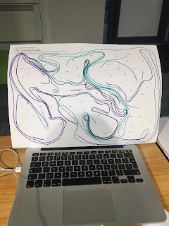


As you can see in the above picture, the two different coloured lines work together with one another rather than against, therefore demonstrating that we were trying to work together. Below is the image of when we worked against one another and one of us tried to win the game, this made it much more difficult as we got very competitive and started to circle each others numbers.

Thursday, 26 January 2017
Initial Ideas for next Brief
The next brief which we have been given gives us the opportunity to design one of three book covers for Penguin Books. The selection is: In Cold Blood, To Kill A Mocking Bird or The Secret Diary of Adrian Mole Aged 13 3/4. There is a variation of books, a fiction book, adult non-fiction and a children's book. I think that i am going to attempt to design the cover for the childrens book as it interests me and the possibilities are a lot more broad.
In today's session with Rob we 'mind-mapped' a range of different ideas. In the centre of the page was the central idea and around it situated a number of different visual thumbnails, sketches and key words and phrases. Once we had done this we then looked at transforming the idea, which meant that we had to invert one element (either the design, movement, theme, structure or audience to name a few examples) and then explore the new outcome. Once this was done we then transformed the next outcome to create a number of different ideas which were just developments of the initial idea which we had come up with.

In today's session with Rob we 'mind-mapped' a range of different ideas. In the centre of the page was the central idea and around it situated a number of different visual thumbnails, sketches and key words and phrases. Once we had done this we then looked at transforming the idea, which meant that we had to invert one element (either the design, movement, theme, structure or audience to name a few examples) and then explore the new outcome. Once this was done we then transformed the next outcome to create a number of different ideas which were just developments of the initial idea which we had come up with.

Image Description Seminar
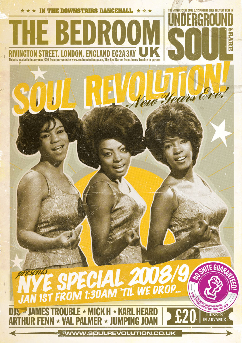
In todays seminar with James we focused on the material which we had been told to bring in, which was 2 images along with two paragraphs of text based on the chosen topic of our essay. We had to use the appropriate referencing along with linking it to the main point of our essay. My chosen essay question is the one about sub-cultures and how they have effected graphic design, I have chosen to focus on Northern Soul and how that movement has influenced designers.
During the first part of the seminar we swapped our pieces of writing with completely different people and we read through each others. We then critically edited them and suggested what they could do better or what they were good at doing. My feedback was mainly positive, my marker said that i was good at: using correct terminology, use of correct grammar, describing things visually, informing the reader. I need to make sure that i don't write sentences which can be considered 'too long' and make sure that they are concise and to the point.
The next task we had to do was to describe our images using three sentences, mine was:
The image is a logo for a venue which was a large contributor to the northern soul movement, it suggested that this particular place was the "heart of soul". The background is mainly black, containing two green circular inner rings which make the text stand out. It is circular and therefore very versatile for design.
Then we had to hand over our images to James who then displayed them on the main screen and we had to guess which description fitted which image, this task was very simple as everyones descriptions were very simple.
Overall this task was helpful for me, i thought this because it gave me a good idea of how i need to go about writing my essay, it also gave me the chance to find out what i needed to improve in order to develop my writing skills.
My images that i used are displayed below:


During the first part of the seminar we swapped our pieces of writing with completely different people and we read through each others. We then critically edited them and suggested what they could do better or what they were good at doing. My feedback was mainly positive, my marker said that i was good at: using correct terminology, use of correct grammar, describing things visually, informing the reader. I need to make sure that i don't write sentences which can be considered 'too long' and make sure that they are concise and to the point.
The next task we had to do was to describe our images using three sentences, mine was:
The image is a logo for a venue which was a large contributor to the northern soul movement, it suggested that this particular place was the "heart of soul". The background is mainly black, containing two green circular inner rings which make the text stand out. It is circular and therefore very versatile for design.
Then we had to hand over our images to James who then displayed them on the main screen and we had to guess which description fitted which image, this task was very simple as everyones descriptions were very simple.
Overall this task was helpful for me, i thought this because it gave me a good idea of how i need to go about writing my essay, it also gave me the chance to find out what i needed to improve in order to develop my writing skills.
My images that i used are displayed below:
Tuesday, 24 January 2017
Synesthetical Art
During todays seminar we learnt about Synesthetical Art, which in simple terms, art which has been influenced by sound. There are a number of different artists which use this technique in order to create aesthetically interesting pieces, including Wassily Kandinsky and Josef Muller Brockman to name a couple of 'big names'.


Wassily Kandinsky knew that music and colour were definitely tied to one another. Kandinsky associated each note with an exact hue. He once said 'the sound of colours is so definite that it would be hard to find anyone who would express bright yellow with bass notes or dark lake with treble'.
Similarly, he created the unifying colour theory in 1923, which was a psychological test in which the patient had to determine which colour fitted to which shape, in this case the shapes were a triangle, square and circle and the colours were the primary colours.
Works:


Josef Muller Brockton depicted a Beethoven concert as bold, angular eccentric circles. He demonstrated a different way of combining multiple sentences.
Works:


After learning about Synesthetic art we began a task which would allow us to think about what we had learnt and how to apply it to art. I chose the writing task, which meant that we had to find a piece of art which had been created with influence from music and then write about the piece and how it visually represents the music. We were told to write about shape, line and colour and how they represent the music that the piece was inspired by.
The image that i chose to use was Kandinsky's Composition VII

Colour:
The colour of this piece is extremely vivid, and almost warming as the main colour is almost a soft yellow, as this is the background of the piece. There are hints of dark blue throughout the piece which which could suggest tension within the piece. There are also hints of light green which I have interpreted as warm and calming parts of the performance. Overall, the colour of this piece suggests that the piece is not all smooth or simplistic, it seems as though there is a range of different sounds which are conveyed in all sorts of ways and in all sorts of different colours, but underneath it is all the piece intends to be joyful for the listener.
Shape:
In this piece, the shapes cannot be defined. They cannot be determined as to where they start or where they end, therefore suggesting that this piece of music is constantly flowing from the off point and until the end. The shapes are a range of different sizes and forms, therefore this could demonstrate the different types of pitch which are apparent within the musical piece.
Line:
The lines are a range of different thicknesses, this could represent all of the different kinds of instruments which are used within the piece, and the sounds that were created. The lines are also crossing over which could mean that multiple sounds are used at once in order to produce an almost chaotic yet soothing sound.
I think that this topic will be incredibly useful for my essay topic, as I am writing about the influence which Northern Soul has had on Graphic Design, and therefore this will be perfect as some of the pieces that have been produced are clearly influenced by the music. This is due to the fact that some of the designs that are produced are messy and rough, but at the same time bold and obvious to what they are trying to portray.
For instance, I have found this Wigan Casino End of an Era ticket and badge. Which you could both describe as being rough at messy, yet the bright colours on the badge make the necessary information stand out within the design.

Monday, 23 January 2017
Motion Graphics: Context, History and Theory
Motion Graphics are pieces of digital footage or animation which create the illusion of motion or rotation, and are usually combined with audio for use in multimedia projects. During todays lecture with Sara we looked at the context, history and theory of motion graphics. We watched a number of different videos which all presented motion graphics in a different way. They are displayed below:
Kreise (excerpt) by Oskar Fischinger
Kreise (excerpt) by Oskar Fischinger from CVM on Vimeo.
Spherikal Ion
Spherikal from Ion on Vimeo.
Strings: J S Bach - Cello Suite No. 1 - Prelude by Alexander Chen
Strings: J.S. Bach - Cello Suite No. 1 - Prelude from Alexander Chen on Vimeo.
AANAATT by Max Hattler
AANAATT (by Max Hattler) from Max Hattler on Vimeo.
Tower Bawher
Motion Graphics has developed hugely through the ages, and with the use of programmes such as After Effects and Cinema 4D, we are able to create our own projects within uni. I am incredibly interested in Motion Graphics and how I can improve my knowledge about the software which is available.
Kreise (excerpt) by Oskar Fischinger
Kreise (excerpt) by Oskar Fischinger from CVM on Vimeo.
Spherikal Ion
Spherikal from Ion on Vimeo.
Strings: J S Bach - Cello Suite No. 1 - Prelude by Alexander Chen
Strings: J.S. Bach - Cello Suite No. 1 - Prelude from Alexander Chen on Vimeo.
AANAATT by Max Hattler
AANAATT (by Max Hattler) from Max Hattler on Vimeo.
Tower Bawher
Motion Graphics has developed hugely through the ages, and with the use of programmes such as After Effects and Cinema 4D, we are able to create our own projects within uni. I am incredibly interested in Motion Graphics and how I can improve my knowledge about the software which is available.
Thursday, 19 January 2017
Example Essay Analysis
In James' seminar this morning, we looked at an example essay which would point us in the right direction for writing our own. We recapped on what we had already covered which was: genealogies, strong opening line, use of APA6th referencing, clipped writing, descriptive and creative writing, perspectivism/non-absolute perspectives.
The advice that we decided on for writing the essay was: give a definition of subcultures at the beginning of the essay, don't write 'this essay will', make sure references are used wherever appropriate and don't write how you speak.
The essay that we read we rated 6/10, although it contained some good points and was fairly descriptive at different points, but it didn't contain the necessary specific information in order to convey the correct message. Therefore i must consider all of this when writing my own essay.
The advice that we decided on for writing the essay was: give a definition of subcultures at the beginning of the essay, don't write 'this essay will', make sure references are used wherever appropriate and don't write how you speak.
The essay that we read we rated 6/10, although it contained some good points and was fairly descriptive at different points, but it didn't contain the necessary specific information in order to convey the correct message. Therefore i must consider all of this when writing my own essay.
Wednesday, 18 January 2017
Essay Deconstruction
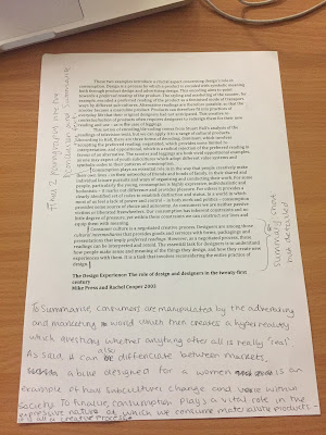
In mondays seminar we looked at an essay which had been written by a previous student. The essay was about consumer culture as a creative process, which is linking into our sub culture essay question which we have been set.
Whilst reading the piece we were set various tasks:

Whilst reading the piece we were set various tasks:
- To highlight and point out each section of the essay - introduction, main body and conclusion
- To show where the writer should've used referencing
- To show where the writer has used particularly good language in order to covey her thoughts
- To write three sentences which describe the whole essay
For the last point our three sentences were:
To summarise, consumers are manipulated by the advertising and marketing world which then creates a hyper reality which questions whether anything after all is 'real'. As said it can also differentiate between markets, a bike designed for women is an example of how subcultures change and how they are represented within society. To finalise, consumption plays a vital role in the expressive nature of which we consume materialistic products - it is all a creative process.
As a group we discussed that it was vital to use APA 6th referencing in order to credit other writers and researchers which have found out things that are of similar nature to your own opinion. It is also important as it is a vital skill within any university course and later life.
The entire essay along with our annotations is shown below, for future reference.


Deconstruction
In this seminar we looked at deconstruction and how it is useful within design. We looked at how a designer had deconstructed a book in order to produce a new book. In this session we were given a number of different passages in which we had to cut out parts which we found interesting and arrange them on a page. We then numbered them and responded to questions which were asked after rolling a dice and saying the phrases that we had selected and numbered. This was a fun session and some of the outcomes were extremely amusing.


I found the topic of deconstruction incredibly interesting and therefore I went to research it even further.
Deconstruction is a method of critical analysis of philosophical and literary language which emphasizes the internal workings of language and conceptual systems, the relational quality of meaning, and the assumptions implicit in forms of expression.
In terms of art and design it means a form of criticism first used by French philosopher Jacques Derrida in the 1970s which asserts that there is not one single intrinsic meaning to be found in a work, but rather many, and often these can be conflicting.
A deconstructive approach to criticism involves discovering, recognising and understanding the underlying and unspoken and implicit assumptions, ideas and frameworks of cultural forms such as works of art.


Morph
In todays seminar we watched this really strange video which was about how things aren't always as they seem. It showed us basic illustrations and animations which were incorporated into a very strange storyline.
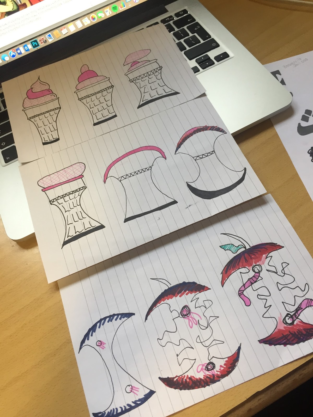
We were then set the task of creating our own 'thing' which was a sort of form of morph art, but we had to start off with something nice and then make it into something dark. I decided to start off with an Ice Cream and then it morphed into a rotten apple.

We were then set the task of creating our own 'thing' which was a sort of form of morph art, but we had to start off with something nice and then make it into something dark. I decided to start off with an Ice Cream and then it morphed into a rotten apple.
Helvetica
In todays lecture and seminar we looked at Helvetica the font. Helvetica is a widely used sans-serif typeface which was developed in 1957 by Swiss typeface designer Max Miedinger and with input from Eduard Hoffman. It is a net-grotesque or realist design, one influenced by the famous 19th century typeface Akzidenz-Grotesk and other German and Swiss designs. It is widely used all over the world and renowned for its crisp and clear quality and modern conveyance of words and phrases. During todays lecture we watched a film about the font and how it was created and produced, it was very informative and told us all that we needed to know about the font and the history behind it.
In the seminar we were giving two sheets of paper with six different styles of Helvetica on it, we were then told to create our own style, which meant a lot of cutting and sticking and producing a new version of the typeface which was designed by ourselves. I thoroughly enjoyed this session as it gave me the opportunity to change the font completely to make it look extremely different.


In the seminar we were giving two sheets of paper with six different styles of Helvetica on it, we were then told to create our own style, which meant a lot of cutting and sticking and producing a new version of the typeface which was designed by ourselves. I thoroughly enjoyed this session as it gave me the opportunity to change the font completely to make it look extremely different.


Monday, 19 December 2016
Semiotics in Christmas Adverts
In todays seminar we looked at how semiotics was present during a range of different Christmas adverts. We determined as a group that christmas adverts have become their own genre due to the fact that there is a wide variety of them available on the television today. From upbeat adverts, to sad and emotional ones, there is a great range which is able to get anyone into the christmas spirit. After watching all of the adverts we found that they all had a number of things in common, they all involved: family, tradition, good will and peace, whilst coming together at christmas. We analysed each advert separately as well.
- Goggle box - family, going to work, toys, overworked, trying to get the perfect gift,
- John Lewis - giving her something she's always wanted, the animals are doing something they shouldn't but their all enjoying it together, they're all reunited except the dog is stuck inside and he's jealous because they're having a lot of fun, they've got the trampoline because not only the young girl will enjoy it. gender stereotype roles.
- Sainsburys - dark and gloomy, a touching subject which inspires all people and affects everyone in different ways, shows both sides reuniting because its christmas, one act of bravery or one person making the first move can make the christmas that much more special. people can move past things to share a special day together, uplifting music. The act of sharing is much more important than anything else. It makes you appreciate whats important
- M&S - shows the stereotypical view of christmas, but shows that children are even willing to move past things in order to make other people happy. different from the normal presumptions of christmas. feminist approach. Mrs Claus represented the women in the help. Connotations of powerful independent women, colour red is very chrsitmassy. Vehicles that she uses are expensive.
- john lewis man on the moon - emotional music, she's trying to reach him but he cant see her, she tries and tries until its christmas day and she finally does it, the moment the package reaches him she sees it. we should consider other people at christmas. people are lonely at christmas, we should consider them as well as ourselves. Balloon and telescope represent her search for him.
Wednesday, 16 November 2016
Type
During todays lecture we learnt about type. A font is the physical embodiment of a collection of letters, numbers and symbols and when referring to the design of the piece as a whole it is called a typeface.
We looked at Jan Tschichold's book called the New Typography, it was a modernist approach to 1920-1930s type design. He combined elements from Bauhaus and Sovien movement in Russia into his book which made it a visually impressive piece.
We also looked at a range of other artists including Herbert Bayer, James Felci, Theo H Ballmer, Walter Dexel, Max Burchartz, Joseph Muller Brockmann, Stanley Morison, Herbert Spencer and Eduard Hoffman. Saul Bass was another artist we looked at, he looked at the consecration of the movie credit sequence as a design object, he defined design as being "thinking made visible".
Kinetic Type is type that moves and we see it every day in digital adverts.
Conceptual type.
We looked at Jan Tschichold's book called the New Typography, it was a modernist approach to 1920-1930s type design. He combined elements from Bauhaus and Sovien movement in Russia into his book which made it a visually impressive piece.
- asymmetric balance of elements
- utilisation of white space
- san serif typography
- advocated lower case letters
- supported the typo photo approach
- content was designed by hierarchy
We also looked at a range of other artists including Herbert Bayer, James Felci, Theo H Ballmer, Walter Dexel, Max Burchartz, Joseph Muller Brockmann, Stanley Morison, Herbert Spencer and Eduard Hoffman. Saul Bass was another artist we looked at, he looked at the consecration of the movie credit sequence as a design object, he defined design as being "thinking made visible".
Kinetic Type is type that moves and we see it every day in digital adverts.
Conceptual type.
Sunday, 30 October 2016
One True Sentence
During this seminar we got the chance to practice our essay writing skills. We were presented with a quote from Ernest Hemingley which said "Do not worry. You have always written before and you will write now. All you have to do is write one true sentence. Write the truest sentence that you know."
From this we were presented with a picture of a bear sat on a chair and we had to write one true sentence, followed by the same sentence but with different parts of added detail. My final sentence was:
The bear was a hazy hue of brown, with sharp claws and its pink tongue sticking out of its mouth. It was sat on an old garden chair with stained arm rests. The door slowly opened behind him. He hadn't eaten all day.
From this exercise we then moved onto pieces which we had collected and we applied the same technique to the pieces. My final sentence was:
The girl wears a scarf with the Stussy logo and style printed all over it, along with an array of chains. Therefore minimalist culture is present. Her makeup is minimal and slightly smudged in order to be in keeping with her current style.
This technique has allowed me to understand how to start off with something quite simple, and then make it into a short paragraph with a great amount of detail about something. I found this seminar incredibly useful.
From this we were presented with a picture of a bear sat on a chair and we had to write one true sentence, followed by the same sentence but with different parts of added detail. My final sentence was:
The bear was a hazy hue of brown, with sharp claws and its pink tongue sticking out of its mouth. It was sat on an old garden chair with stained arm rests. The door slowly opened behind him. He hadn't eaten all day.
From this exercise we then moved onto pieces which we had collected and we applied the same technique to the pieces. My final sentence was:
The girl wears a scarf with the Stussy logo and style printed all over it, along with an array of chains. Therefore minimalist culture is present. Her makeup is minimal and slightly smudged in order to be in keeping with her current style.
This technique has allowed me to understand how to start off with something quite simple, and then make it into a short paragraph with a great amount of detail about something. I found this seminar incredibly useful.
Triangle, Circle, Square - A Psychological Test
In 1923 Wassily Kandinsky conducted a questionnaire at the Bauhaus to get students and teachers to fill in a triangle, circle and square with the primary colours. He hoped to discover a universal correspondence between form and colour, embodied in the equation: blue=circle, red=square and yellow=triangle.
I conducted my own experiment with my flat mates and these were the responses:

I conducted my own experiment with my flat mates and these were the responses:

The reasons behind the choices:
1) "This is the most eligible choice and i think it is right, I'm not really into art but this looks right to me"
2) "This is definitely the right colours, the primary colours have to go in order and these are the colours that I would associate with the shapes"
3) "I'm not too sure, but I think that these colours are right"
Surrealism and The Uncanny Valley
The Revolution movement was in the 1920s, it involved breaking away from realism and escaping the harshness of reality. This meant that various artists reform the world in their own way. They controlled from reason, therefore meaning that they were breaking away from the normality.
All surrealists had their own manifesto and their own way of presenting the movement.
The Surrealist Revolution Magazine (1924-1929)
In the 1960s surrealism hit other countries.
In many surrealist pieces eyes are used as part of the piece, and eyes are considered a metaphor of new ways of seeing the world.
'The Uncanny' was coined by Sigmund Freud in 1919, it means being attracted to something but being disturbed at the same time. Freud - uncanny meaning opposition rather than likeliness.
Winkler and Noah, Liera (2006) - weird, none human whilst being unrealistic but realistic at the same time.
The Shining (1980) uncanny likeness, a likeness thats strange and incomplete.
Uncanny Vally - visual representation of a theory (1970)
Final Fantasy - plummets into uncanny valley and destroyed the illusion of reality.
- Salvador Dali was a large influence and a major contributor to surrealism. He combined the unusual juxtaposition of objects on the canvas. He also worked with Disney to create a surrealist aesthetic. For instance, Dumbo is a classic disney film which Dali had input into, it includes pink elephants which could be considered dark and almost trippy, there are various weird combinations and metamorphisms.
- Andre Breton-Poet was also another contributor to this movement, his key ideas was 'long live the revolution' therefore he was focusing on transforming the world.
- Alphabet - Jindrich Heisher - surrealism has intertwined with typography
- Andre Masson - automatic drawing: allowing mistakes the be made, and they're all automatic, manifesto "pure psychic"
- Rene Magritte - The False Mirror (1928) - questioning how accurate the eyes truly are
- Remedios Varo - his collage demonstrates the interesting relationships between juxtaposition
- Max Ernst - thinking about the process that is necessary in order to execute juxtaposition
All surrealists had their own manifesto and their own way of presenting the movement.
The Surrealist Revolution Magazine (1924-1929)
In the 1960s surrealism hit other countries.
In many surrealist pieces eyes are used as part of the piece, and eyes are considered a metaphor of new ways of seeing the world.
'The Uncanny' was coined by Sigmund Freud in 1919, it means being attracted to something but being disturbed at the same time. Freud - uncanny meaning opposition rather than likeliness.
Winkler and Noah, Liera (2006) - weird, none human whilst being unrealistic but realistic at the same time.
The Shining (1980) uncanny likeness, a likeness thats strange and incomplete.
Uncanny Vally - visual representation of a theory (1970)
Final Fantasy - plummets into uncanny valley and destroyed the illusion of reality.
Monday, 17 October 2016
Form Follows Function
Modernism ran from 1890 - 1940:


- It was characterised by a shift away from traditional forms of expression in the arts and literature
- It included innovative forms of expression which signalled a deliberate departure from previously existing styles of the late 19th and 20th century
- Creative disciplines often focused on expressing feelings and ideas; creating abstractions and fantasies, rather than representing the world in an accurate or real way
- A rejection of historical styles as a source of architectural form
- An adaption of the machine aesthetic
- A rejection of ornament
The Bauhaus opened in 1919 in Weimar, Germany, following its opening it relocated to Dessau in 1925 and closed in Berlin in 1933. It reopened in Chicago in 1937 and majority of the original tutors followed to its new location.
The Bauhaus wanted to combine art, craft and technology to reach a common goal and vision of purer forms of design without unnecessary decoration. It was practical, functional and clean. Ideas and principles were transferred between disciplines in an exchange of ideas towards a common goal.
There are a range of different artists and designers which are associated with Bauhaus;
- Josef Albers
- Marianne Brant
- Daniel Reed
- Wassily Kandinsky
- Paul Klee
- Lazlo Moholy Nagy
- Marcel Breuer
- Joost Schmidt
- Wilhelm Wagenfeld
- Walter Gropius
- Felix Keller
A lot of different things have been influenced by the Bauhaus, and it is ironic that we often look to and foreground the Bauhaus aesthetic as something desirable in itself.


Subscribe to:
Posts (Atom)