During this seminar we got the chance to practice our essay writing skills. We were presented with a quote from Ernest Hemingley which said "Do not worry. You have always written before and you will write now. All you have to do is write one true sentence. Write the truest sentence that you know."
From this we were presented with a picture of a bear sat on a chair and we had to write one true sentence, followed by the same sentence but with different parts of added detail. My final sentence was:
The bear was a hazy hue of brown, with sharp claws and its pink tongue sticking out of its mouth. It was sat on an old garden chair with stained arm rests. The door slowly opened behind him. He hadn't eaten all day.
From this exercise we then moved onto pieces which we had collected and we applied the same technique to the pieces. My final sentence was:
The girl wears a scarf with the Stussy logo and style printed all over it, along with an array of chains. Therefore minimalist culture is present. Her makeup is minimal and slightly smudged in order to be in keeping with her current style.
This technique has allowed me to understand how to start off with something quite simple, and then make it into a short paragraph with a great amount of detail about something. I found this seminar incredibly useful.
Sunday, 30 October 2016
Triangle, Circle, Square - A Psychological Test
In 1923 Wassily Kandinsky conducted a questionnaire at the Bauhaus to get students and teachers to fill in a triangle, circle and square with the primary colours. He hoped to discover a universal correspondence between form and colour, embodied in the equation: blue=circle, red=square and yellow=triangle.
I conducted my own experiment with my flat mates and these were the responses:

I conducted my own experiment with my flat mates and these were the responses:

The reasons behind the choices:
1) "This is the most eligible choice and i think it is right, I'm not really into art but this looks right to me"
2) "This is definitely the right colours, the primary colours have to go in order and these are the colours that I would associate with the shapes"
3) "I'm not too sure, but I think that these colours are right"
Surrealism and The Uncanny Valley
The Revolution movement was in the 1920s, it involved breaking away from realism and escaping the harshness of reality. This meant that various artists reform the world in their own way. They controlled from reason, therefore meaning that they were breaking away from the normality.
All surrealists had their own manifesto and their own way of presenting the movement.
The Surrealist Revolution Magazine (1924-1929)
In the 1960s surrealism hit other countries.
In many surrealist pieces eyes are used as part of the piece, and eyes are considered a metaphor of new ways of seeing the world.
'The Uncanny' was coined by Sigmund Freud in 1919, it means being attracted to something but being disturbed at the same time. Freud - uncanny meaning opposition rather than likeliness.
Winkler and Noah, Liera (2006) - weird, none human whilst being unrealistic but realistic at the same time.
The Shining (1980) uncanny likeness, a likeness thats strange and incomplete.
Uncanny Vally - visual representation of a theory (1970)
Final Fantasy - plummets into uncanny valley and destroyed the illusion of reality.
- Salvador Dali was a large influence and a major contributor to surrealism. He combined the unusual juxtaposition of objects on the canvas. He also worked with Disney to create a surrealist aesthetic. For instance, Dumbo is a classic disney film which Dali had input into, it includes pink elephants which could be considered dark and almost trippy, there are various weird combinations and metamorphisms.
- Andre Breton-Poet was also another contributor to this movement, his key ideas was 'long live the revolution' therefore he was focusing on transforming the world.
- Alphabet - Jindrich Heisher - surrealism has intertwined with typography
- Andre Masson - automatic drawing: allowing mistakes the be made, and they're all automatic, manifesto "pure psychic"
- Rene Magritte - The False Mirror (1928) - questioning how accurate the eyes truly are
- Remedios Varo - his collage demonstrates the interesting relationships between juxtaposition
- Max Ernst - thinking about the process that is necessary in order to execute juxtaposition
All surrealists had their own manifesto and their own way of presenting the movement.
The Surrealist Revolution Magazine (1924-1929)
In the 1960s surrealism hit other countries.
In many surrealist pieces eyes are used as part of the piece, and eyes are considered a metaphor of new ways of seeing the world.
'The Uncanny' was coined by Sigmund Freud in 1919, it means being attracted to something but being disturbed at the same time. Freud - uncanny meaning opposition rather than likeliness.
Winkler and Noah, Liera (2006) - weird, none human whilst being unrealistic but realistic at the same time.
The Shining (1980) uncanny likeness, a likeness thats strange and incomplete.
Uncanny Vally - visual representation of a theory (1970)
Final Fantasy - plummets into uncanny valley and destroyed the illusion of reality.
Monday, 17 October 2016
Planning my Sketchbook
Today I have been very poorly and unable to attend University. So I thought i'd take the time to create a plan for my concertina sketchbook and begin artist research. Below is a picture of my plan:


I have chosen to find an artist which is associated with each word within each theme, this way i have covered every aspect of the brief in great detail. Today I also began to compose various artist research files.
Process & Production - Animation Brief
During this session we experimented using After Effects, we chose a short music clip from a free music site and then had to match colours to each beat. We used a Pantone Chip selection which we were told to bring with us, I chose mainly blue hues and then we were instructed on how to make the colour of the screen change to the beat of the music. Once this was created it we exported the video and uploaded it to Vimeo.

ColourClip from Jessica Mountford on Vimeo.

ColourClip from Jessica Mountford on Vimeo.
Species of Spaces - Mini Sketchbooks
During this session we were given the task to create mini sketchbooks which would give us an idea of how we needed to set out our actual sketchbook. We had to create mini books which told the reader a story which slowly zoomed in into the actual meaning of the story. I used fine liners and pro markers to create my drawings which told stories of when I visited my grandparents in Spain and when I went to Berlin with my friends.


In the afternoon session we got into groups of five and were given a long stretch on paper, on which we had to map everyones memories and link them together somehow. Our group used thick black lines to show the movement throughout the page. The images below show what we created.


Location Drawing
During this session we were sent out into town to draw various iconic pieces of architecture within Huddersfield. Our groups was assigned the Train Station on St George's Square. It was designed by the architect James Pigott Pritchett, it is well known for its classical-style facade, with its six columns which dominate the square.
We were given a section of the area each and mine was the station building itself, I decided to use fine liners to complete my drawing with the addition of colour which came at the very end. I learnt how to use a fine liner to create crisp edges and lines which would emphasise various parts of the design of the building. We only had a limited amount of time for this piece so it had to be done quickly. My finished result is presented below.


We were given a section of the area each and mine was the station building itself, I decided to use fine liners to complete my drawing with the addition of colour which came at the very end. I learnt how to use a fine liner to create crisp edges and lines which would emphasise various parts of the design of the building. We only had a limited amount of time for this piece so it had to be done quickly. My finished result is presented below.

After we had presented our work to the rest of the class and our individual groups, we stuck our work to the wall and arranged it how our area was set out in the physical world, almost mapping the places which we had drawn. This created a fantastic looking collage.


After this session I decided to research into artists who mainly focus on locations and drawing them.
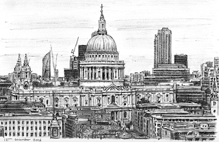
Stephen Wiltshire
Stephen Wiltshire is an artist who draws and paints detailed cityscapes. He has a particular talent for drawing lifelike, accurate representations of cities, sometimes after having only observed them briefly. He was awarded an MBE for services to the art world in 2006. He studied Fine Art at City & Guilds Art College. His work is popular all over the world, and is held in a number of important collections. He is known for his ability to draw from memory a landscape after seeing it just once.
His work is completed using mainly one form of drawing tool, such as pencil, fine liner or watercolour. This produces a rough finish, but the designs he creates are incredibly interesting. Below are some of my favourite pieces which he has produced, some being completely monochrome, whilst others have hints of colour which make the piece even more interesting.

1977-79 Lincoln Continental Mark V

Chicago River, USA

Bruges, Belgium

Philadelphia Skyline

St Pauls Cathedral, UK
I have enjoyed researching this artist as it has given me an insight for if I were to do location drawing again. I would be able to challenge myself and just look at the location once, taking in all of its features and colours, and then drawing it from memory. This would create an interesting finish as I think it would look quite rushed and the line markings would always be unsure.
John Banovich
John Banovich (b.1964) is an American contemporary oil painter known internationally for his large, dramatic portrayals of iconic wildlife. Today, Banovich’s work is admired and collected globally by prominent politicians, entertainers, business leaders and art collectors. His work can be found in private collections, corporate offices and museums throughout the world.
Although, this artist mainly focuses on animals, the animals are all in different locations, and therefore the artist does somewhat produce pieces which are related to location. The images that I have found are in complete contrast to the previous ones as they are filled with colour and beautiful animals.

Three Generations, 2008

Master of the Heard, 2016

Game Of Lions, 2014

Under the Hunting Moon, 2014

The Sentinels, 2014
As you can see, I have collected his work from the past few years, therefore demonstrating that he is still creating work which is incredibly interesting to look at. These paintings are also incredibly lifelike and the artist is extremely talented. I have enjoyed looking at this work and getting ideas about colours and settings.
Form Follows Function
Modernism ran from 1890 - 1940:


- It was characterised by a shift away from traditional forms of expression in the arts and literature
- It included innovative forms of expression which signalled a deliberate departure from previously existing styles of the late 19th and 20th century
- Creative disciplines often focused on expressing feelings and ideas; creating abstractions and fantasies, rather than representing the world in an accurate or real way
- A rejection of historical styles as a source of architectural form
- An adaption of the machine aesthetic
- A rejection of ornament
The Bauhaus opened in 1919 in Weimar, Germany, following its opening it relocated to Dessau in 1925 and closed in Berlin in 1933. It reopened in Chicago in 1937 and majority of the original tutors followed to its new location.
The Bauhaus wanted to combine art, craft and technology to reach a common goal and vision of purer forms of design without unnecessary decoration. It was practical, functional and clean. Ideas and principles were transferred between disciplines in an exchange of ideas towards a common goal.
There are a range of different artists and designers which are associated with Bauhaus;
- Josef Albers
- Marianne Brant
- Daniel Reed
- Wassily Kandinsky
- Paul Klee
- Lazlo Moholy Nagy
- Marcel Breuer
- Joost Schmidt
- Wilhelm Wagenfeld
- Walter Gropius
- Felix Keller
A lot of different things have been influenced by the Bauhaus, and it is ironic that we often look to and foreground the Bauhaus aesthetic as something desirable in itself.


Wednesday, 5 October 2016
Convergence
To converge means to come together from different directions so as eventually to meet. In normal talk, this means the translation of information. Between information being communicated, and it being understood theres a moment of translation or interpretation, which means that the consumer understands what is being communicated.
There are different forms of convergence: the convergence of different technologies; convergence of ideas; convergence of practices.
My plan is to better equip myself to communicate with efficacy.
An idea that converges the hardest because of a whole complex mix of circumstances is a catalytic culture. A catalyst is a substance that increases the rate of a chemical reaction, or in our case a person or thing that precipitates an event.
As a designer it is my job to master and understand my own style of visual communication, so that I can produce high quality pieces which are exactly what the client wants.
Various artists use visual metaphors to communicate a message through an illusional device; one which uses pictures to represent words or parts of words. An example of this is Paul Rand's IBM Rebus (as shown below) as he uses graphic images to display the true meaning of the piece.

In art and design criticism, form and content are considered district aspects of a work of art or design. The term form refers to the works style, the techniques and media used to create it.
In this seminar we also looked at The Medium is the Message, written by Marshall Macluhan. The central theory behind this is that the medium through which content is carried plays a vital role in the way that it is perceived.
We also did an activity in which we had to create our own version of the medium is the message using cut outs from every day newspapers and magazines.

When researching further, I also came across a post produced book, called The Medium is the Massage, this book demonstrates the complete opposite of what the Macluhan book is trying to convey. The book is 160 pages in length and composed in an experimental, collage style with text superimposed on visual elements and vice versa. Some pages are printed backwards and are meant to be read in a mirror. Some are intentionally left blank. Most contain photographs and images both modern and historic, juxtaposed in startling ways.
The book was intended to make McLuhan's philosophy of media and communication, considered by some incomprehensible and esoteric, more accessible to a wider readership through the use of visual metaphor and sparse text.
This book demonstrates convergence as two parties are coming together to create something which is almost sarcastic and a mick take of something which is genuinely quite serious.


Sense of Place
The first brief.
At first I was fairly fazed by the whole idea and the different ways that we could go about completing this brief, but after we had a group discussion I found it much easier to process all the different ideas which were flying around my head. Within the brief there are five different themes: exploring the city, the city as a species of spaces, the city as a system of objects, the city as image and the city as language. In order to complete this task we must concentrate on the purpose of the observer and what they want to find out whilst completing this project.
During the group discussion we looked at a number of different aspects, including artists, designers, authors and musicians. By doing this it gives us a broad spectrum of different types of producers who all do something which is to do with the briefs title. We developed a number of post it notes which were then stuck to one of the walls within the studio. We also received our concertina sketchbook which would be a catalogue of primary and secondary research.


What is Genealogy?
During this seminar we learnt about the principles of genealogy and what it actually means. Genealogy is almost like a family tree, but for ideas and theories and how they have developed. The principles of genealogy are as follows:
In the seminar we did an activity which meant that we had to project our own emergence from a list of different things which could happen in the near future. We got into small groups and our group chose to do 'Tinted sunglasses are fashionable'. We came up with a range of emergences, including some very deep comments such as 'people wouldn't see the world the same because they are wearing these glasses' and 'people could answer the phone which would make them even lazier than they currently are'. There is a picture below of all the emergences which we created.

- Creative formation of histories from particular perspectives
- Multiplicitous and often contradictory
- They are never about declaring absolute origins
- Genealogies are resident - they are among many
In the seminar we did an activity which meant that we had to project our own emergence from a list of different things which could happen in the near future. We got into small groups and our group chose to do 'Tinted sunglasses are fashionable'. We came up with a range of emergences, including some very deep comments such as 'people wouldn't see the world the same because they are wearing these glasses' and 'people could answer the phone which would make them even lazier than they currently are'. There is a picture below of all the emergences which we created.

"Intuition is a flash of light"
What is a theory? What is contained within a theory? What is beyond commercial design?

Three very complex questions which are soon to be answered as my knowledge in design theory broadens. According to Terry Eagleton "there is no reading of a work which is not also a re-writing" meaning that no matter what the consumer depicts from the work in front of them, they are always re-writing new and interesting meanings. Therefore, no matter what kind of work we produce, whether it be personal or for a client, the way that the consumer reads it will be different.
Visual communication is something that must be considered at all times, it is the conveyance of ideas and information, in forms that can be read or viewed. These forms can be almost anything, from signs to drawings and many other different things.
Visual communication is key because seeing comes before words, and therefore a child looks and recognises before it can speak. This is the same with a developed mind, because as long as the piece is highly visual then the viewer can instantly acquire its intended meaning.
"A theory provides an explanatory framework which can be used to explore or support ideas, develop hypothesis or as a basic for critique" therefore, theory is important in no matter what kind of art / design you are producing, because without it, the piece has no internal inspiration or influence, and the piece will have no critical background.
The title of this post is taken from a quote by Paul Rand (the god father of Graphic Design) saying that "intuition is a flash of light conditioned by experience, culture and imagination" this 'flash of light' can come in all kinds of forms and will affect each designer differently. Therefore we cannot say that everyone is inspired by the same kind of thing, and this is what makes each designer different and unique in their own way. In order to command your own creativity you must firstly gain design authorship, a term coined by Stephen Heller, my thoughts on this is that you must firstly be your own client and figure out your own personal style before approaching others for their ideas and strategies, because theory must have substance as well as style, and if you as the designer has the style but doesn't know the substance behind it then you will struggle to develop it even further.
"An idea that is not dangerous is unworthy of being called an idea" - Oscar Wilde, I as a future designer strongly agree with this quote, because in order to develop your skills you must be dangerous and take risks.
During the seminar following this lecture, we looked at the First Things First 2000 manifesto. The activity was to block out any parts of information in order to create phrases which were personal to ourselves. A favourite statement which I created was "Designers devote their efforts primarily to help draft a reductive and immeasurably harmful code of public discourse", in simple terms, I think that this means that we as graphic designers need to make sure that we do everything possible in order to supply the public eye with visually complex and interesting pieces.

Subscribe to:
Posts (Atom)