Monday, 6 November 2017

Self Publishing - The Poster


A poster is any piece of printed paper designed to be attached to a wall or vertical surface.
Typically posters include both textual and graphic elements, although a poster may be either wholly graphical or wholly text.
Posters are designed to be both eye-catching and informative.
Posters may be used for many purposes. 

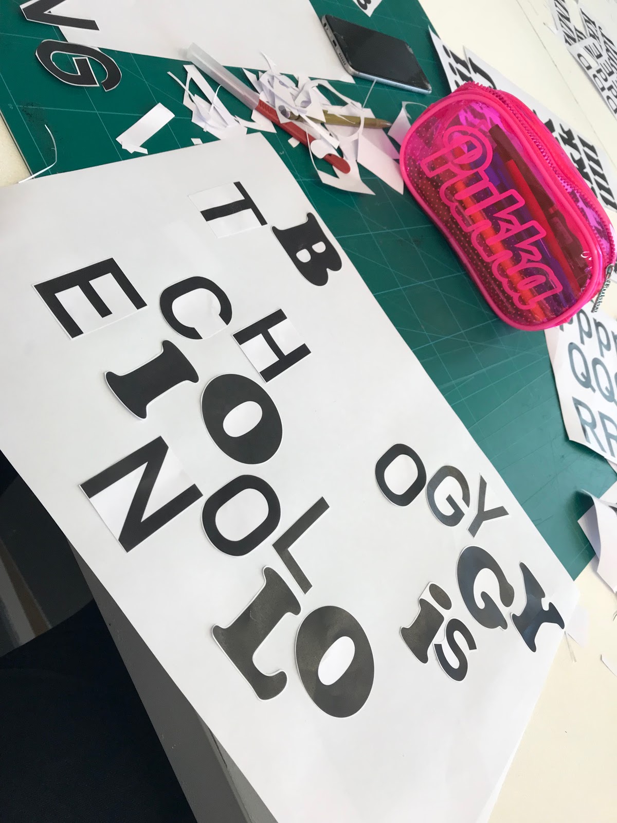
Todays process and production workshop was one of the most interesting and enjoyable ones that we have had this year so far. We were set the task of creating a number of different posters, using only the letters which we had been provided with. There were a number of different type faces which we were provided with, each to represent some how a different feeling or to give a different portrayal. We were also given a number of phrases that we needed to make posters for, we were also time constricted so these posters had to be quick and simply done.  Below are the phrases we had to use in order to create the posters, we worked in pairs to create the maximum amount of posters possible in the time that we were given. 

Posters Produced:


At the end of the session Nick picked out his favourite posters and separated them from the rest which had already been stuck up. Much to my surprise, my "We're all sensitive people" poster was used within the top three for my intuitive thinking and use of the back of the paper to hide the word 'sensitive'. 


I also found later on that my square poster had been used on the HUDGDA Instagram which was something that i was quite proud of. 


Monday, 23 October 2017

Cinema 4D Surface/Deformers/Textures/Particles

This was the second Cinema 4D workshop that we worked on, this session was all about exploring different aspects of the software and how easy it would be to produce something that was not only visually interesting but also professional looking. We looked at creating particles and patterns which would then be applied into both still and moving images and animations which we would export at the end of the session.

For the first part of the workshop we made a simple outline of a square.


We then extruded the object and applied the twist tool to create a twisted tube. 


Then I crated a material which used the checkerboard effect which we then applied to the inside of the twisted tube, to make an almost trippy pattern.


We then created a sphere, which we also applied this colour way too but we changed it slightly so that the sphere would stand out in the centre of the piece. 


This is what it looked like in render preview.


We then animated the piece so that there were multiple particles floating round the tube. At the end of this post there will be a video containing all of the things that I have made during this session. 


This next part, was all about making an interesting looking background quickly and efficiently but with minimal effort. The outcome was extremely professional looking. 


The final part of the workshop was to create an animated scene which could be used as a title sequence or just a simple informative piece about the topic chosen. 

Finally I created an After Effects document which contained all of the animated work I had produced during that day, it made it much easier for me to upload and store. 

Cinema 4D Surface/Deformers/Textures/Particles from Jessica Mountford on Vimeo.

Wednesday, 11 October 2017

After Effects - Exploring Geometry

During todays session we were set on the task of creating ten seconds of motion. Which included recapping skills which we previously learnt last year, Sara explained that year two is all about generating new and different ideas along with approaching them differently too, therefore making the pieces much more personal. We also discussed what goes on in your own mind, how you think, how you create ideas, how do you focus? Trust that your best work will eventually come, which is something that everyone must accept as we are not fully skilled yet.

Before beginning the workshop, we watched a couple of different videos which we would use as inspiration for the session.
MGMT - All We Ever Wanted Was Everything from oneedo on Vimeo.

We also watched a number of videos created by Steffen K, due to the fact that he works a lot with shapes and that is what we are focusing on during this session:


30 motion tests in 30 seconds from Steffen K on Vimeo.
Animation Sequence Project from Steffen K on Vimeo.


Finally we created a short clip which was made up of a number of shorter clips and shapes that we had created previous to this session. I was impressed with my recollection of what i created last year as it made it much easier to complete this workshop.


Exploring Geometry - After Effects Year 2 Session 1 from Jessica Mountford on Vimeo.

Wednesday, 4 October 2017

Self Publishing - Session 1

During this session we were taught about the importance of self publishing and where it originated from. A particular quote that stood out to me during this session was:
"Bookbinding is in itself a comparatively simple matter and is easily described: but it is associated with great and interesting conditions of society, moreover, like every other handicraft, is on its ideal side a discipline and a type of life." - T. J. Cobden Sanderson - 1895.
The printing press is another factor that pushed for self publishing, as it was the first kind of publishing, it broke the monopoly on printing.
We then created a Zine, which contain all of the information which we learnt about during the session, along with opinions of our own which we think are appropriate. The zine needed to be visually interesting along with being informative about the information we had been provided with.


Within this Zine I looked at a couple of different artists but I didn't have time to print out the images which would be included within my zine. Therefore I will add some additional images onto the end of this post to demonstrate their works. 

Laura Oldfield-Ford


Cory Doctorow


Friday, 29 September 2017

Cinema 4d as a Design Tool


In today's session we were introduced to Cinema 4d, it is a 3D modeling, animation, motion graphic and rendering application developed by MAXON Computer GmbH in Germany. Our main purpose for today was to look at the basic things which it can produce and learn how to use these functions effectively. 

Before even opening the software we were shown a number of different videos. One of those was the Channel 4 rebrand which was worked on by DBLG, these motion graphics were produced on Cinema 4d and therefore it was a prime example of what the software can actually do and produce. These motions could have easily been created by hand but by doing them by using this software has made the entire process much quicker and therefore the time management has been thoroughly thought out. 


We then moved on to looking at websites which provide easy to follow and simple tutorials, this would aid us if we wanted to produce something else in our own time. The websites were:
https://greyscalegorilla.com
http://www.eyedesyn.com

We also looked at an instagram account of a motion graphic designer called @Baugasm, they produce an animated poster everyday for 365 days, using Cinema 4d, I was particularly interested in these images as they are not only visually interesting but also very simplistic in terms of how they have been produced.


After looking at all of these resources we then moved onto beginning to create our own design which we would then move into Cinema 4d to animate. We firstly created a simple line drawing of either a letter or some form of design which would be simple and easy to animate. In order to do this we used illustrator. I created a simple 'J' which I then imported onto Cinema 4d. 


Once this was done, we extruded the object in order to add depth to it, so that it was 3D. Once this was done we used the render preview button to see what the final outcome would look like. To see that the object was just floating and didn't really have any depth to it makes it seem very plain and boring.


We then added a floor and a background, to make the piece slightly more interesting, along with the addition of some extra text which made the actual design more visually interesting.


Once this was done, colour was definitely the next step, we created three different materials, which would change the colour of various different elements.


Once this was done, our designs were almost finished, we just needed to add lighting and the camera feature in order to create a still of the piece.


Below is my final still piece, in which it shows shadows in order to create another aspect to the piece and to make it more 'real'. This is important within design as it makes the whole piece look more professional and more realistic.


We then moved onto animating the piece, this was easy and simple to do with the use of keyframes and the rotation option. We also used a Null layer in order to rotate the camera and the lighting around the object to make sure that it was positioned at the right place during the sequence. 


Cinema 4d as a Design Tool from Jessica Mountford on Vimeo.

Friday, 5 May 2017

Final Wixsite

During one of Sara's last sessions, we were told that we had to develop three of our Process and Production workshops and display them using either Persona or an alternative site. I chose to use Wix as I have used it before and it is less complicated than Persona. I added a separate page for each different development so that they are easy to distinguish between. I also tried to make the page interactive.


Due to the fact that some of my images have pixelated, I have added the blog link at the end of each page so that you can refer back to the original post if the images are not of a high quality. 


https://jessmountford97.wixsite.com/wixsite

Thursday, 4 May 2017

After Effects Book Trailer Development

At the start of term one of the first sessions which we had with Sara was to create a book trailer. I decided to focus on a children's story - Cinderella. My first book trailer didn't go very well and therefore I wanted to improve it. I wanted to create a number of illustrations, which I would combine with my developed After Effects skills and knowledge.

Firstly I planned out what I was going to include in my piece. I figured out a total of five illustrations - Cinderella in her messy clothes, Cinderella at the ball, a pumpkin, an invitation and a glass slipper. These would all be recognisable aspects from the story and therefore making it easily recognisable. I then started to create them. They are all 1920 x 1080 pixels, which is the screen size what I used for the animation itself.


These illustrations were inspired by Hungry Sandwich Club and their Park project which was made for B4 Parking. The illustrations that they have created have no outline, and they are incredibly simple, which is something which I wanted to include within my work. The characters that they have created have minimal features, but for my work I wanted my characters to have no features, so that the audience purely recognised them for their colours and forms, this therefore making my animation more intriguing and interesting. I have enjoyed looking at Hungry Sandwich Club's work as it has gave me ideas for future projects, it will be a great reference for me to use in the future. 


This is the animation which I created next. The transitions of the illustrations work well. But I think it needs to be made simpler. From looking at other book trailers for children, they are incredibly simple with minimal information and mainly the same font. Meaning that they are clearly and easily understood. Therefore I developed this even further and created another piece.


This is my final animation, after much development and trial and error, I have settled on the font Futura to use throughout the piece, this is a font which is recognisable worldwide and it is also incredibly easy to read therefore making it perfect for my purpose. I chose to use various sizing techniques on the first part of text which appears within the animation, this makes the emphasis and the attention focus mainly on the title of the book "Cinderella", which is an important part of the trailer. I also added the type writer effect to this section of text as I thought it would look interesting and also build up a sense of wonder for when the audience is watching it. I added more text throughout, but instead of making it fly of the screen like in my previous piece, I decided to make it extremely simple so that it was east to read. Also, by having minimal text it makes it much easier to view the illustrations, which are the most interesting parts of the animation. The overall transitions work well within the animation and I am very happy with how it has turned out. 


Final After Effects Workshop

During todays session with Sarah we completed our final After Effects piece. This piece needed to have something in it which flew from right to left, it also needed to be something that was in the sky. My idea was a rocket, and therefore I created this using Adobe Illustrator.
I took inspiration from an image I'd seen online to create this image, which I then separated into different layers so that I could work more with it when I imported it onto After Effects.
                    I then created two further images which I would be able to use within my space scene. I used fade effects on both images when creating them on Adobe Illustrator in order to make them in-keeping with my rocket. I wanted to keep them still in my animation, which would make the rocket look like it was flying around them within the solar system. Therefore I would add a continuous effect onto each planet in order to make them bob up and down throughout the entirety of the animation. Below is my final animation, which I created using the skills which I had learnt in the previous workshops, I found this incredibly interesting and it also gave me the opportunity to develop my After Effects skills even further. 

Final Project - Rocket In Space from Jessica Mountford on Vimeo.

Once we had all finished, we sent our animations to Sara who then put them all into one large video, which can be seen below. This was incredibly useful and helpful as it gave us the chance to see other peoples work and what they had achieved throughout the previous weeks.

Group B Finale - 16:40 from Motion-go on Vimeo.