In todays session with John we looked at creating our own typeface and how we would go about it. Instead of jumping straight in and using our own ideas we took influence from a number of different sheets of images which he had prepared before the session. We were then given normal paper, tracing paper and graph paper which we used to create our designs. We also used a range of different materials and experimented with different styles. We had to use only five letters as they are the most visually interesting and most difficult to transform - A S E N G. I used pro markers, sharpies, greyscale markers, fine liners and pencil. Below is the result of this session which i thoroughly enjoyed.
Thursday, 26 January 2017
Initial Ideas for next Brief
The next brief which we have been given gives us the opportunity to design one of three book covers for Penguin Books. The selection is: In Cold Blood, To Kill A Mocking Bird or The Secret Diary of Adrian Mole Aged 13 3/4. There is a variation of books, a fiction book, adult non-fiction and a children's book. I think that i am going to attempt to design the cover for the childrens book as it interests me and the possibilities are a lot more broad.
In today's session with Rob we 'mind-mapped' a range of different ideas. In the centre of the page was the central idea and around it situated a number of different visual thumbnails, sketches and key words and phrases. Once we had done this we then looked at transforming the idea, which meant that we had to invert one element (either the design, movement, theme, structure or audience to name a few examples) and then explore the new outcome. Once this was done we then transformed the next outcome to create a number of different ideas which were just developments of the initial idea which we had come up with.
Image Description Seminar
In todays seminar with James we focused on the material which we had been told to bring in, which was 2 images along with two paragraphs of text based on the chosen topic of our essay. We had to use the appropriate referencing along with linking it to the main point of our essay. My chosen essay question is the one about sub-cultures and how they have effected graphic design, I have chosen to focus on Northern Soul and how that movement has influenced designers.
During the first part of the seminar we swapped our pieces of writing with completely different people and we read through each others. We then critically edited them and suggested what they could do better or what they were good at doing. My feedback was mainly positive, my marker said that i was good at: using correct terminology, use of correct grammar, describing things visually, informing the reader. I need to make sure that i don't write sentences which can be considered 'too long' and make sure that they are concise and to the point.
The next task we had to do was to describe our images using three sentences, mine was:
The image is a logo for a venue which was a large contributor to the northern soul movement, it suggested that this particular place was the "heart of soul". The background is mainly black, containing two green circular inner rings which make the text stand out. It is circular and therefore very versatile for design.
Then we had to hand over our images to James who then displayed them on the main screen and we had to guess which description fitted which image, this task was very simple as everyones descriptions were very simple.
Overall this task was helpful for me, i thought this because it gave me a good idea of how i need to go about writing my essay, it also gave me the chance to find out what i needed to improve in order to develop my writing skills.
My images that i used are displayed below:
Tuesday, 24 January 2017
Synesthetical Art
During todays seminar we learnt about Synesthetical Art, which in simple terms, art which has been influenced by sound. There are a number of different artists which use this technique in order to create aesthetically interesting pieces, including Wassily Kandinsky and Josef Muller Brockman to name a couple of 'big names'.
Wassily Kandinsky knew that music and colour were definitely tied to one another. Kandinsky associated each note with an exact hue. He once said 'the sound of colours is so definite that it would be hard to find anyone who would express bright yellow with bass notes or dark lake with treble'.
Similarly, he created the unifying colour theory in 1923, which was a psychological test in which the patient had to determine which colour fitted to which shape, in this case the shapes were a triangle, square and circle and the colours were the primary colours.
Josef Muller Brockton depicted a Beethoven concert as bold, angular eccentric circles. He demonstrated a different way of combining multiple sentences.
Works:
After learning about Synesthetic art we began a task which would allow us to think about what we had learnt and how to apply it to art. I chose the writing task, which meant that we had to find a piece of art which had been created with influence from music and then write about the piece and how it visually represents the music. We were told to write about shape, line and colour and how they represent the music that the piece was inspired by.
The image that i chose to use was Kandinsky's Composition VII
Colour:
The colour of this piece is extremely vivid, and almost warming as the main colour is almost a soft yellow, as this is the background of the piece. There are hints of dark blue throughout the piece which which could suggest tension within the piece. There are also hints of light green which I have interpreted as warm and calming parts of the performance. Overall, the colour of this piece suggests that the piece is not all smooth or simplistic, it seems as though there is a range of different sounds which are conveyed in all sorts of ways and in all sorts of different colours, but underneath it is all the piece intends to be joyful for the listener.
Shape:
In this piece, the shapes cannot be defined. They cannot be determined as to where they start or where they end, therefore suggesting that this piece of music is constantly flowing from the off point and until the end. The shapes are a range of different sizes and forms, therefore this could demonstrate the different types of pitch which are apparent within the musical piece.
Line:
The lines are a range of different thicknesses, this could represent all of the different kinds of instruments which are used within the piece, and the sounds that were created. The lines are also crossing over which could mean that multiple sounds are used at once in order to produce an almost chaotic yet soothing sound.
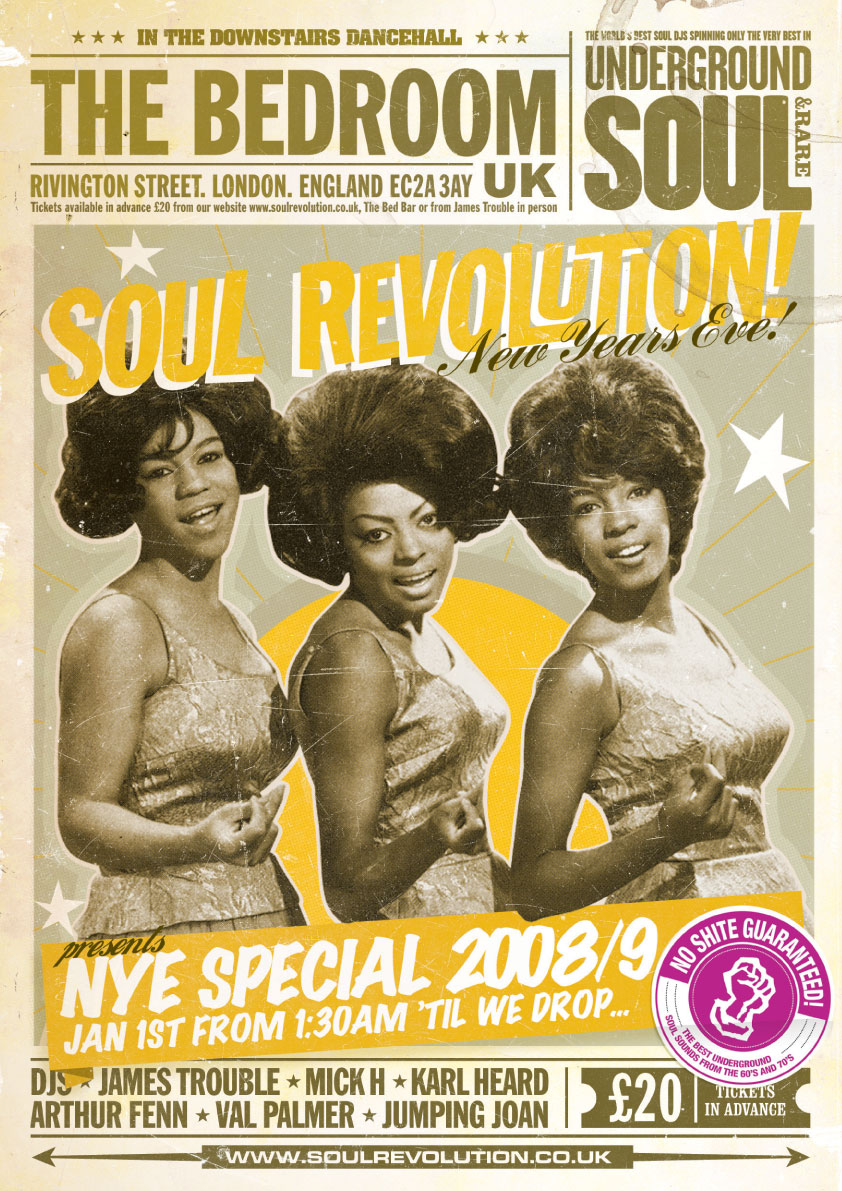
I think that this topic will be incredibly useful for my essay topic, as I am writing about the influence which Northern Soul has had on Graphic Design, and therefore this will be perfect as some of the pieces that have been produced are clearly influenced by the music. This is due to the fact that some of the designs that are produced are messy and rough, but at the same time bold and obvious to what they are trying to portray.
For instance, I have found this Wigan Casino End of an Era ticket and badge. Which you could both describe as being rough at messy, yet the bright colours on the badge make the necessary information stand out within the design.
Monday, 23 January 2017
Motion Graphics: Context, History and Theory
Motion Graphics are pieces of digital footage or animation which create the illusion of motion or rotation, and are usually combined with audio for use in multimedia projects. During todays lecture with Sara we looked at the context, history and theory of motion graphics. We watched a number of different videos which all presented motion graphics in a different way. They are displayed below:
Kreise (excerpt) by Oskar Fischinger
Kreise (excerpt) by Oskar Fischinger from CVM on Vimeo.
Spherikal Ion
Spherikal from Ion on Vimeo.
Strings: J S Bach - Cello Suite No. 1 - Prelude by Alexander Chen
Strings: J.S. Bach - Cello Suite No. 1 - Prelude from Alexander Chen on Vimeo.
AANAATT by Max Hattler
AANAATT (by Max Hattler) from Max Hattler on Vimeo.
Tower Bawher
Motion Graphics has developed hugely through the ages, and with the use of programmes such as After Effects and Cinema 4D, we are able to create our own projects within uni. I am incredibly interested in Motion Graphics and how I can improve my knowledge about the software which is available.
Thursday, 19 January 2017
Interactive PDF Documents
In todays process and production workshop with Rob we learnt about creating interactive PDF documents, this would mean that we would be able to attach buttons and videos onto the page in order to present it through a PDF and it would still work.
Firstly we set up an InDesign document and we made sure that it was standard screen size which would mean that it would fit onto any screen, it would also mean that when placing media onto the page that we would maximise the amount of space we would have for displaying work.
We then inserted a video onto the page and set it to start playing as soon as the PDF was opened, we then changed that and added focus points which we would use later. When placing the video onto the document it looked incredibly blurry but after previewing it we found that it wasn't actually blurry.
The next thing we did was creating buttons, which would control the video. The first one we made simply played the video, which meant we had to turn off the automatic play. We then made a button which played the video from the focus point that we had previously created. And the final button was created using external images which we made on photoshop, this added an extra interaction to the button as it changed colour as the mouse hovered over it and also when it was clicked.
We then exported the document and you could use everything that we had made and it worked successfully, i enjoyed this session as it has enabled me to find out different ways to present my work.
Example Essay Analysis
In James' seminar this morning, we looked at an example essay which would point us in the right direction for writing our own. We recapped on what we had already covered which was: genealogies, strong opening line, use of APA6th referencing, clipped writing, descriptive and creative writing, perspectivism/non-absolute perspectives.
The advice that we decided on for writing the essay was: give a definition of subcultures at the beginning of the essay, don't write 'this essay will', make sure references are used wherever appropriate and don't write how you speak.
The essay that we read we rated 6/10, although it contained some good points and was fairly descriptive at different points, but it didn't contain the necessary specific information in order to convey the correct message. Therefore i must consider all of this when writing my own essay.
Wednesday, 18 January 2017
Essay Deconstruction
In mondays seminar we looked at an essay which had been written by a previous student. The essay was about consumer culture as a creative process, which is linking into our sub culture essay question which we have been set.
Whilst reading the piece we were set various tasks:
- To highlight and point out each section of the essay - introduction, main body and conclusion
- To show where the writer should've used referencing
- To show where the writer has used particularly good language in order to covey her thoughts
- To write three sentences which describe the whole essay
For the last point our three sentences were:
To summarise, consumers are manipulated by the advertising and marketing world which then creates a hyper reality which questions whether anything after all is 'real'. As said it can also differentiate between markets, a bike designed for women is an example of how subcultures change and how they are represented within society. To finalise, consumption plays a vital role in the expressive nature of which we consume materialistic products - it is all a creative process.
As a group we discussed that it was vital to use APA 6th referencing in order to credit other writers and researchers which have found out things that are of similar nature to your own opinion. It is also important as it is a vital skill within any university course and later life.
The entire essay along with our annotations is shown below, for future reference.
Deconstruction
In this seminar we looked at deconstruction and how it is useful within design. We looked at how a designer had deconstructed a book in order to produce a new book. In this session we were given a number of different passages in which we had to cut out parts which we found interesting and arrange them on a page. We then numbered them and responded to questions which were asked after rolling a dice and saying the phrases that we had selected and numbered. This was a fun session and some of the outcomes were extremely amusing.
I found the topic of deconstruction incredibly interesting and therefore I went to research it even further.
Deconstruction is a method of critical analysis of philosophical and literary language which emphasizes the internal workings of language and conceptual systems, the relational quality of meaning, and the assumptions implicit in forms of expression.
In terms of art and design it means a form of criticism first used by French philosopher Jacques Derrida in the 1970s which asserts that there is not one single intrinsic meaning to be found in a work, but rather many, and often these can be conflicting.
A deconstructive approach to criticism involves discovering, recognising and understanding the underlying and unspoken and implicit assumptions, ideas and frameworks of cultural forms such as works of art.
Location Drawing: third session
During this session with John we looked at sculptures which had been created within the workshop with things such as cardboard boxes and items which people had created. I enjoyed this session as it gave us the opportunity to do live drawing again, we also had access to a number of different drawing tools which made the drawings even more experimental. We had about 40 minutes on each station and then we rotated. I enjoyed this session as it gave me the opportunity to do hand drawn type again.
Morph
In todays seminar we watched this really strange video which was about how things aren't always as they seem. It showed us basic illustrations and animations which were incorporated into a very strange storyline.
We were then set the task of creating our own 'thing' which was a sort of form of morph art, but we had to start off with something nice and then make it into something dark. I decided to start off with an Ice Cream and then it morphed into a rotten apple.
Helvetica
In todays lecture and seminar we looked at Helvetica the font. Helvetica is a widely used sans-serif typeface which was developed in 1957 by Swiss typeface designer Max Miedinger and with input from Eduard Hoffman. It is a net-grotesque or realist design, one influenced by the famous 19th century typeface Akzidenz-Grotesk and other German and Swiss designs. It is widely used all over the world and renowned for its crisp and clear quality and modern conveyance of words and phrases. During todays lecture we watched a film about the font and how it was created and produced, it was very informative and told us all that we needed to know about the font and the history behind it.
In the seminar we were giving two sheets of paper with six different styles of Helvetica on it, we were then told to create our own style, which meant a lot of cutting and sticking and producing a new version of the typeface which was designed by ourselves. I thoroughly enjoyed this session as it gave me the opportunity to change the font completely to make it look extremely different.
Morpholo Tiles
In todays session we learnt about Morpholo Tiles. They are a set of tiles which link together in a certain order and they are generated by a code which is created using a certain formula.
Firstly we looked at different fonts which we found visually interesting, and then we picked certain aspects of the letters that we wanted to draw. Which is showed in the image below:
During the session we chose various numbers from a spread sheet and entered them into an online generator which showed us which tiles we were to create. This then generated squares which showed us which edges we had to touch with the letters that we wanted to create, it didn't have to be full letters, we were more just creating parts of letters. I found this sessions incredibly interesting and made me think of more ideas for my current project.
Subscribe to:
Posts (Atom)