Monday, 20 February 2017

Coca Cola Lecture

James Sommerville is the vice president of Coca Cola Global Design.


He attended art school when he was 17-18 in Batley, and was incredibly interested in pavement art, which could be considered youth marketing. He was inspired by a number of different things around that time period, including magnum watches, atari, computers and phones to name a few.
He created the brand Attik which started in an attack bedroom in Paddock, the company was looking for talented and next generation artists and designers.  He mentioned that he had a desire to get into motion graphics, and he worked for MTV to create some of their most recognisable motion graphics.

He started working for Coca Cola in 2006, and he admits that he is still inspired by his hometown of Huddersfield. He says that he always treats the design of a product as if it deserves to be in an art gallery, and therefore he always produces the best of work. Everything is inspired by the people around them. He says that he tries to make things familiar yet surprising.


Agencies of the future, companies will keep trying to sell you stuff and therefore designers will keep finding new ways to do it. Story telling will get you further. Starting something new is unknown until you get into it.


Coca Cola's logo was first drawn by an accountant, it includes a normal looking sans serif font.
Coca Cola is over 400 brands, including Fanta and Schwepps. It has gone from one colour to four. They want to bring the red into all of the colours so that it is always prominent, this is the way that it was always meant to be. Rising red disc. Influences a lot of graphic design.


Wednesday, 8 February 2017

Helvetica Deconstruction on InDesign

During todays session with Rob we were set the task of creating a booklet on InDesign which was based on the Helvetica typeface deconstruction we did before Christmas in a seminar with Anna and Rob. All of the images were scanned in and we had to use them to create an interesting cover design and a minimum of four double page spreads on the font and how we achieved the outcomes that we did. We were told that this document was more visual than informative so that made it much easier to create.


This is the cover that I created, it didn't turn out as i wanted as I had to leave early to get to work on time. But this is what i created in the time that i had. 

Thursday, 2 February 2017

Library Session

During todays session with Rob we were let loose in the library in order to find some interesting books which related to anything that we were interested in. I wanted to get a couple of books which would relate to my essay and another couple which would relate to my studio project. I ended up coming out with about six different books of different sizes and topics, these are all interesting and i look forward to reading them whenever i get the chance.

Key Words

During todays seminar with James we looked at each others work and marked it critically, offering helpful advice and correcting mistakes if there were any. Me and Joe marked each others and we came up with some good ideas for each others essays. I found this task incredibly helpful.

We then got into small groups in which we had one image, and we had to come up with ten key words for the image, this proved quite difficult as we had the hardest image to describe. Once we had come up with ten words we passed them onto the next group who then came up with a few sentences containing all of the words which we had provided them with. We did the same to our new image. Once this was done we swapped a few key words for new ones and repeated the process. This session enabled us to understand that we can make greatly detailed sentences from ten key words.


I used this technique when it came to writing my essay, it made it much easier to get straight to the point whilst using words which are interesting and complex, rather than dull words. I used the words - subculture, Northern Soul, provoked, originated, influential, values, members and distinguishable, to create the introduction to my essay. 

"The thoughts which are provoked when thinking about graphic design are enormously wide and with the help of subcultures they are growing even more. A subculture is a sector of society whose members have a shared pattern of behavior and values distinguishable from the mainstream culture (The Penguin English Dictionary). I wanted to focus around the subculture which is Northern Soul, as it is something that has not only originated from where I live, but also something that I think has been incredibly influential to Graphic Design."

Although I have gone into much more depth in order to produce this paragraph, I have used the same technique which James has taught us in order to produce an incredibly interesting introduction to my essay.

Wednesday, 1 February 2017

Working Collaboratively

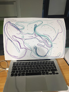
During yesterdays seminar with Rob we did an activity in which we had to join the numbers together, without crossing over any other lines. For the first part me and my partner - Lorna, worked together so we could complete the puzzle, this demonstrated that we were more willing to work together collaboratively rather than working against each other, below is an image of this:


As you can see in the above picture, the two different coloured lines work together with one another rather than against, therefore demonstrating that we were trying to work together. Below is the image of when we worked against one another and one of us tried to win the game, this made it much more difficult as we got very competitive and started to circle each others numbers. 


Thursday, 26 January 2017

Type Drawing with John

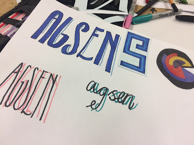
In todays session with John we looked at creating our own typeface and how we would go about it. Instead of jumping straight in and using our own ideas we took influence from a number of different sheets of images which he had prepared before the session. We were then given normal paper, tracing paper and graph paper which we used to create our designs. We also used a range of different materials and experimented with different styles. We had to use only five letters as they are the most visually interesting and most difficult to transform - A S E N G. I used pro markers, sharpies, greyscale markers, fine liners and pencil. Below is the result of this session which i thoroughly enjoyed.


Initial Ideas for next Brief

The next brief which we have been given gives us the opportunity to design one of three book covers for Penguin Books. The selection is: In Cold Blood, To Kill A Mocking Bird or The Secret Diary of Adrian Mole Aged 13 3/4. There is a variation of books, a fiction book, adult non-fiction and a children's book. I think that i am going to attempt to design the cover for the childrens book as it interests me and the possibilities are a lot more broad.

In today's session with Rob we 'mind-mapped' a range of different ideas. In the centre of the page was the central idea and around it situated a number of different visual thumbnails, sketches and key words and phrases. Once we had done this we then looked at transforming the idea, which meant that we had to invert one element (either the design, movement, theme, structure or audience to name a few examples) and then explore the new outcome. Once this was done we then transformed the next outcome to create a number of different ideas which were just developments of the initial idea which we had come up with.